My mission was to imagine and create a new visual communication approach to launch a new model of sports watch for golden youth between the ages of 18 and 25.
In order to capture this new young and sporty target for Maison Cartier, I analyzed the company's current brand image in order to create two alternative logos using typography as a central concept. The other key elements were the creation of the packaging of the watch, the exhibition strategy in their windows and the creation of advertising material for the launch of this watch. This project was presented to the Cartier marketing department manager.
Product Name: Ronde Solo
Typography

Project 1 / Logo
In connection with the name "RONDE", I wanted to exploit the meaning of roundness. The logo was designed to have two readings: visual reading and written reading.
Project 2 / Logo
This watch has a special feature: its hands. I wanted to exploit this detail so I transformed them and incorporated them into a graphic element.
Graphic elements

In order to create a representative packaging for the Ronde Solo watch, I chose to change the border elements of the traditional Cartier red box. The symmetrical hands of the Ronde Solo watch allowed me to recreate a new graphic element in order to use it as the border of the case, thus creating a strong signature that could represent a Ronde Solo.
Packaging detailed below:


Color palette


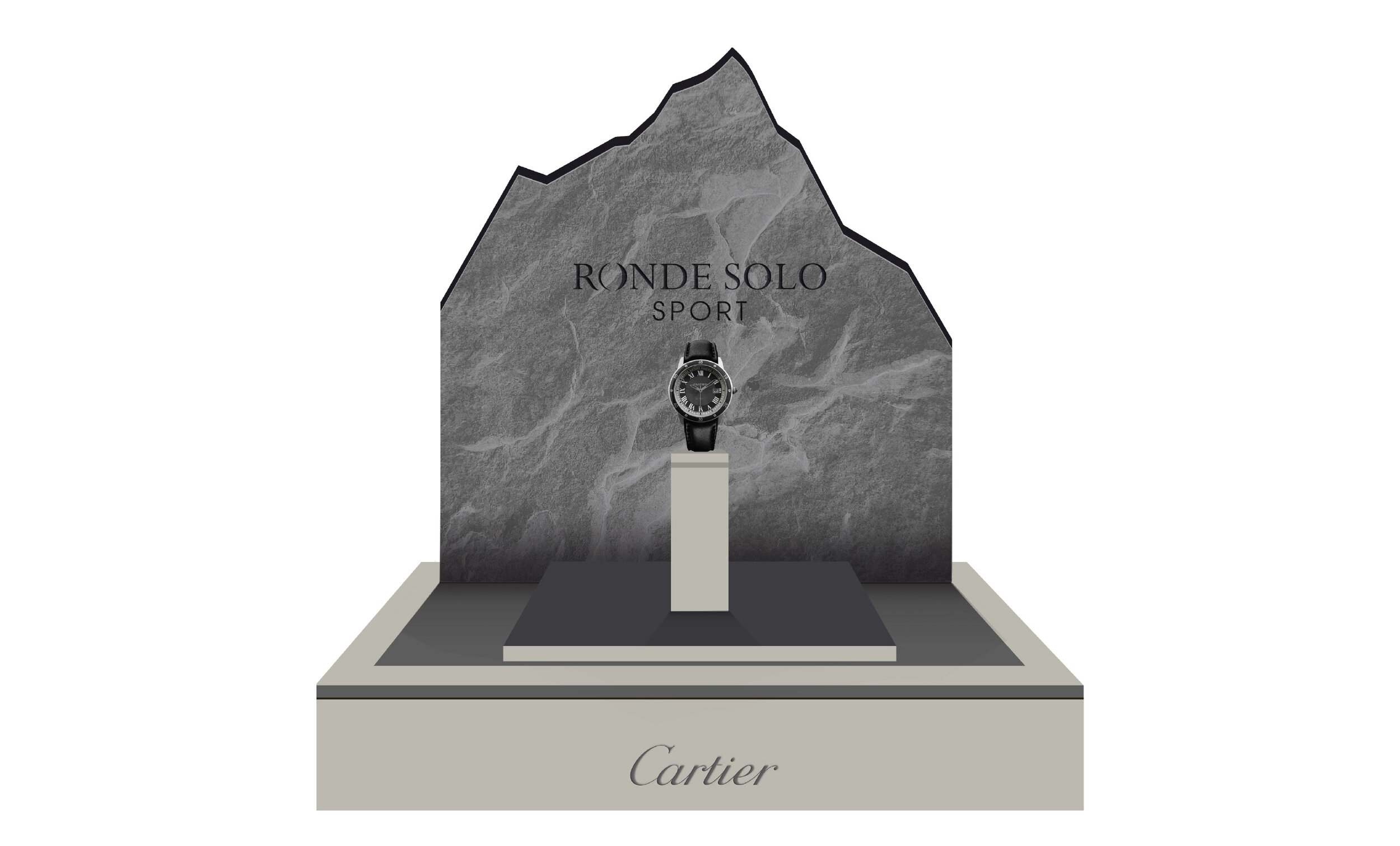
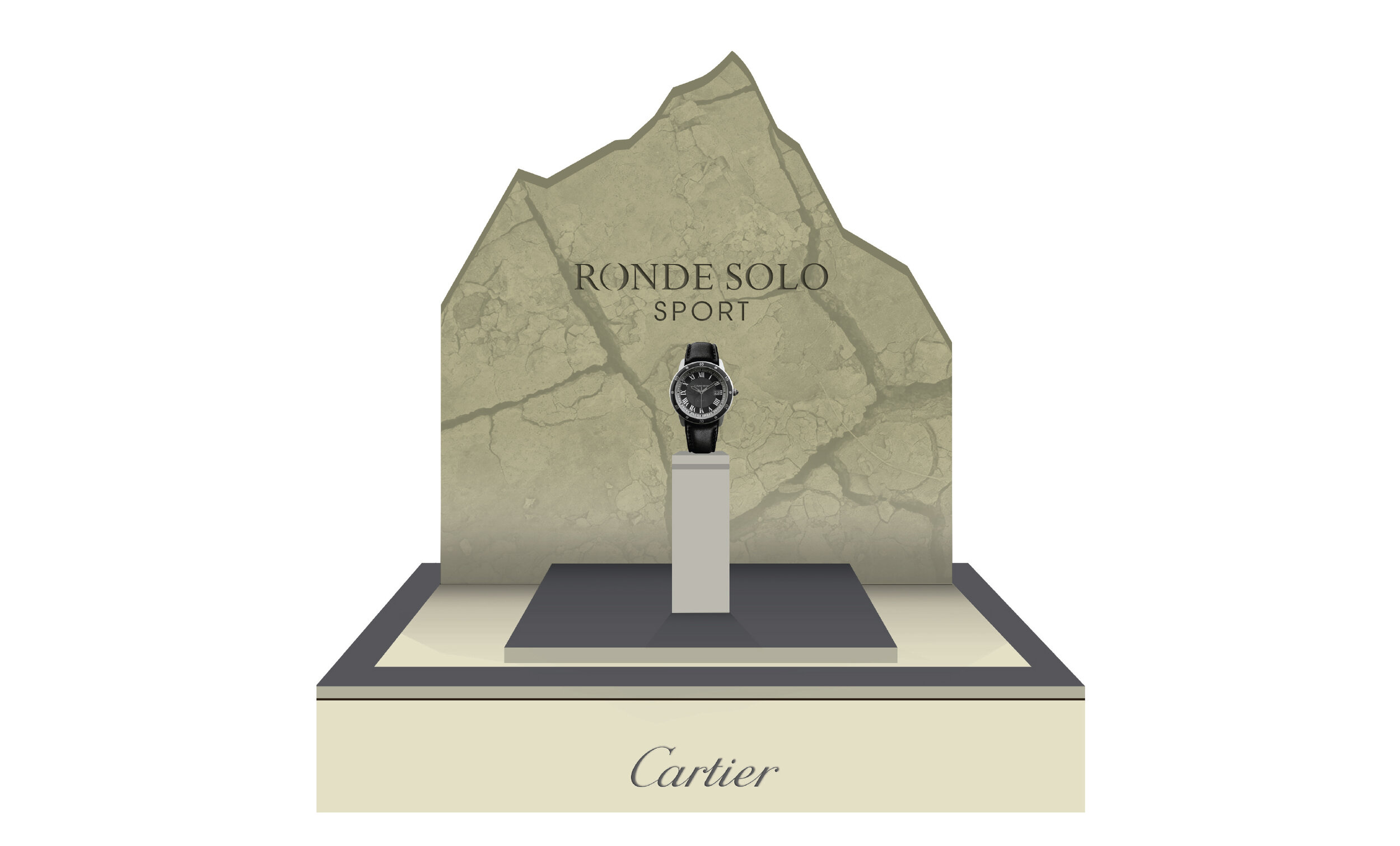
Showcases