Crewasis
- UI/UX Design - Desktop
Crewasis, a data science company based in Brooklyn and founded by Sharon Joseph, leverages open-source data to integrate AI into the project discovery phases of its clients. The company specializes in providing tailored solutions and insights to enhance the creation of business project briefs. By streamlining this process, Crewasis aims to boost client acquisition and maintain relevance in a rapidly evolving industry.
Our team’s mission is to transform the platform’s user experience (UX) by integrating valuable user insights. We strive to make the platform more engaging, easy to use, and effective, ensuring it aligns with the specific needs and preferences of the target business audience.
Our Development Journey
The need for redesigning the Crewasis platform emerged from the challenges users faced with the existing system. We aimed to address these issues by simplifying workflows and modernizing the user interface (UI). Over three weeks, our team worked closely with Crewasis engineers and UX designers, conducted extensive research, and incorporated user feedback into our design process.
Timeline
3 Weeks
Team
Taylor and Darin
Tools
Figma
Rolle
UX/UI Designer
Competitive Analysis
As the lead researcher, I gathered insights from interviews that transformed our competitive analysis with TrendHunter and Gartner. We pinpointed ways to enhance Crewasis' platform, focusing on refining existing features instead of chasing after flashy new ones.
From our interviews, 25% of participants said illustrations made data easier to understand. We took a cue from TrendHunter’s use of visuals and revamped Crewasis to include eye-catching graphs and illustrations, which really boosted comprehension in our usability tests!
Plus, 100% of participants felt intimidated by AI platforms. We noticed that Gartner offered personalized support, while Crewasis relied on a less helpful AI bot. So, we added step-by-step guides and more human support to help users navigate confidently
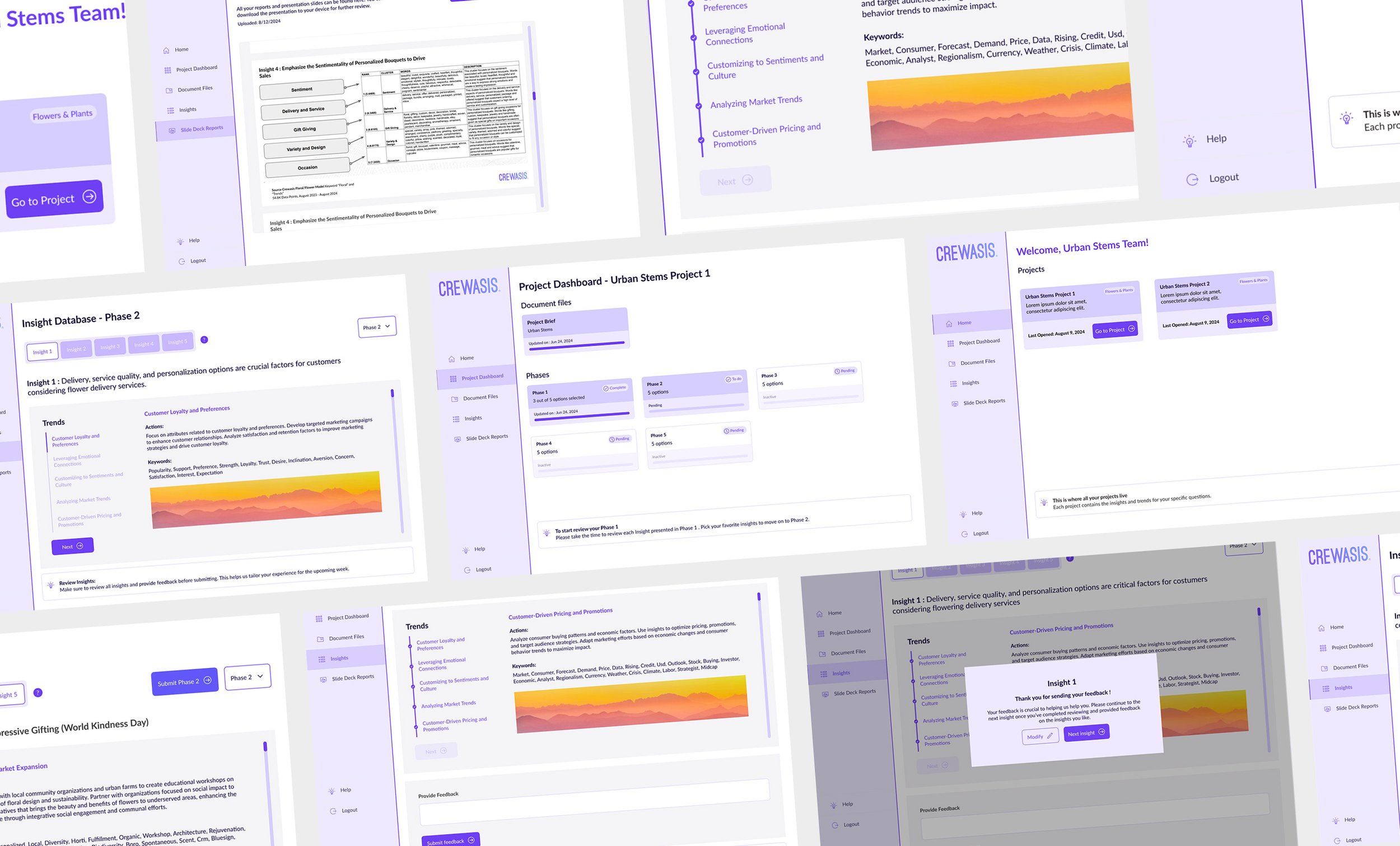
The current platform posed significant challenges in terms of understanding its functions and user flow. Users found it difficult to grasp how to navigate and utilize the platform effectively. To address these issues, we consulted with the UX team and engineering team. However, the responses from these teams were insufficient, as neither had a complete understanding of the platform’s full use. This lack of clarity necessitated a deeper dive into usability testing to uncover and address the core problems.
Through extensive usability testing, we were able to identify and address these issues, leading to improvements that made the platform more intuitive and aligned with user needs.
Understanding and Addressing User Challenges


Complex Navigation
Users found the platform hard to navigate, especially new users. The confusing layout and complex naming conventions made it difficult for them to find what they needed. We realized that a simpler, more intuitive navigation system was necessary.

Visual Appeal
Feedback indicated that the platform’s design was seen as outdated and unprofessional. Users described it as “amateur” with too much empty space. We needed to update the design to be more modern and engaging.

Guidance and Clarity
Many users struggled with the lack of clear instructions and guidance. They were unsure of what to do next, which led to frustration. We added better guidance and clearer instructions to improve the user experience.
Overwhelming Clicks
Users were overwhelmed by the number of clicks needed to access useful information. They wanted a more direct way to get to the data they needed without excessive clicking.
Usability testing led us to create a user persona that accurately represents our typical user, guiding our redesign to better meet real user needs.
Meet Charles, our personna.

Charles has spent over 8 years in digital marketing, with the last 5 years in a managerial role at a large enterprise. His responsibilities include overseeing large-scale marketing campaigns, managing a team of marketers, and ensuring the company’s digital strategies are aligned with business goals. While Charles has a solid foundation in marketing strategies, he's increasingly aware of the importance of data-driven insights, especially in a corporate environment where decisions have significant impacts. However, the complexity and variety of AI tools available make him feel overwhelmed, and he is searching for a solution that is both effective and easy to integrate into his team's workflow.
Behaviors:
Prioritizes tools that provide clear, impactful insights.
Regularly reads industry reports, attends conferences, and consults with peers to stay ahead of marketing trends and technologies.
Goals:
Difficulty integrating new AI tools.
Frustration with tools that require extensive setup time
Disappointment with platforms that promise much but fail to deliver in a user-friendly manner, leading to wasted resources.
Frustrations:
Use data-driven insights to enhance marketing strategies.
Find an effective AI tool that is easy to integrate into his team’s workflow.
Ideation Phase
As we entered the Ideation Phase, our team set out to address the challenges identified in previous research and usability testing. Our goal was to reshape the Crewasis platform into a more user-friendly and engaging tool. Here’s how our ideas evolved.
1
User Experience (UX) Optimization
We envisioned a platform with a smooth and intuitive user experience. Our focus was on simplifying workflows and reducing complexity to make interactions seamless and user-friendly. By streamlining the user journey, we aimed to eliminate confusion and enhance overall efficiency.
2
UI Revamp
Recognizing the need for a fresh look, we proposed a complete revamp of the platform’s user interface. The goal was to create a visually appealing design that aligns with current design trends. This new aesthetic would not only make the platform more attractive but also improve user engagement.
3
Alignment with Core Values
We wanted the platform’s design and functionality to reflect Crewasis’ core values and brand identity. Ensuring that the platform communicated the company’s mission and vision was crucial. This alignment would reinforce Crewasis’ brand while providing a cohesive user experience.
Final Idea
By combining these elements, our final concept focused on delivering a platform that is both smooth and user-friendly. Through enhancements to both the UX and UI, we aimed to create a modern, intuitive design that simplifies navigation and allows users to interact with the platform effortlessly. This comprehensive approach was designed to make the platform not only more effective but also more engaging for users.
One major concern about the Crewasis platform was its unprofessional look, mainly due to its flat color scheme. To spice things up, we introduced several enhancements during prototyping, including gamified elements like checkmarks in the trends and insights section, making it fun for users to track their progress!
Since it’s crucial for users to fully engage with all trends and insights, we added a feature that ensures they can’t skip or skim content—only after reviewing everything can they navigate freely. Plus, we leveraged Crewasis' signature blackthorn berry color to spotlight key features, boosting visual appeal and creating a more intuitive, professional user experience.


